Revamping Certification
Re-thinking the Certification process
During my time in the team we improved the registration flow, re-worked the Certification pages, and increased the amount of people getting Certified.
We had generally quite low registration rates for our Certifications. People weren't aware that we had them, weren't signing up to DataCamp for them, and if they did find our product, weren't registering. We found a lot of gaps in the experience from discovering our product, to taking the Certification, so we redesigned it.
The main issues we tackled
Visibility and onboarding
Designing pages for each certification, and improving the onboarding flow to improve conversion and activation.
Logged in experience
Redesigning the logged in certification pages to better explain our value and improve conversion.
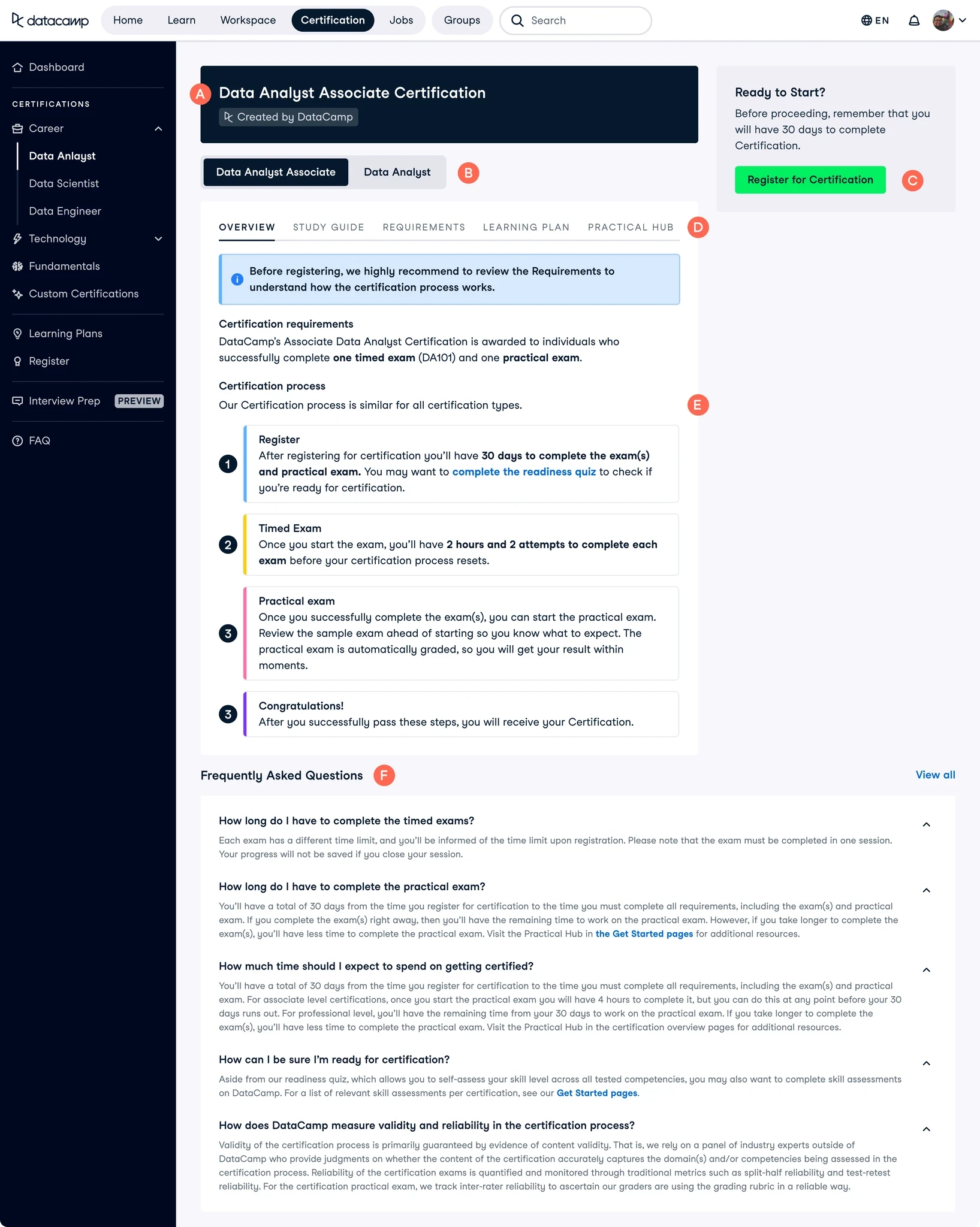
Step one: Where is Certification?
We did not have a full set of dedicated Certification pages on our logged-out website, which really hurt discoverability. Based on our personas, user feedback, and competitor research, I created a structure for how I wanted the pages to flow.
I kept the following in mind while designing:
Understand at a glance - Ensure key pieces of information are front and centre above the fold
Breakdown of process - Help the user understand what a Certification is, and what they will have to do as part of one
Social proof - Highlight that others have taken Certifications before, and that they have had positive experiences. People tend to follow the behaviour of the majority, and so it is important to surface thoughts & opinions of people who have enjoyed our product
Smooth navigation onwards - Ensure the user can keep exploring if they didn't find what they were initially looking for
Additional benefits - Highlight any benefits to our product that make us unique. We have a Certified Community which we previously didn't show, so I wanted to create space to highlight this.
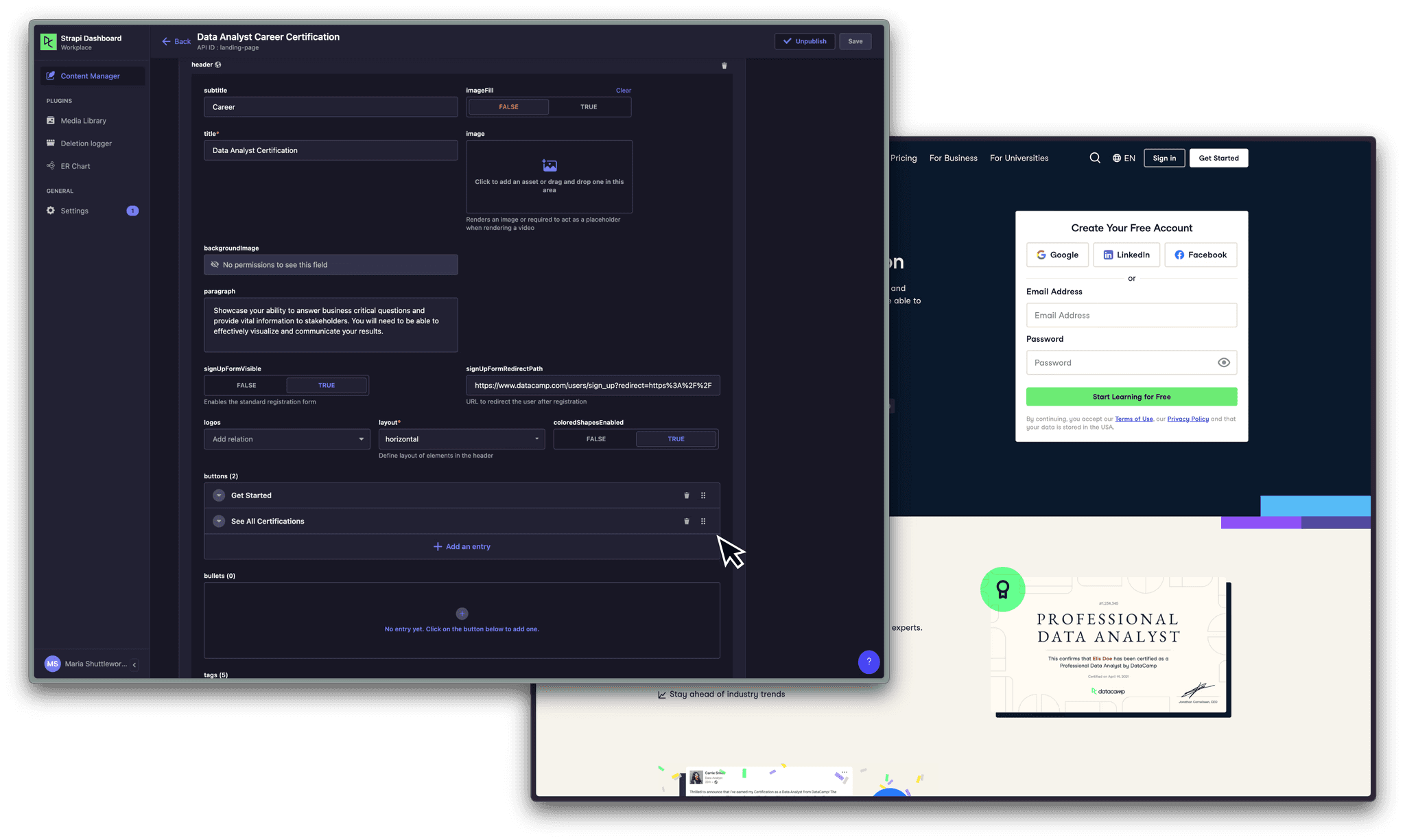
An example of working with our CMS Strapi
After collaborating with the team on exploration and wireframing, I collaborated with the copy and content teams to create engaging text for the pages. This included organising page localisation, as DataCamp had recently launched in Spanish. This was tricky as I had not previously had experience with organising copy creation or localisation, and was largely due to the fact we didn't yet have a product manager on the team to help with this, however I was able to learn from the process.
A limitation of the project was that I had to work with our CMS, Strapi, which restricted our design options. However we were able to represent DataCamp's design language in the end, after a small learning curve.
Final designs: Easy registration and clearly explaining the process
To reduce bounce rates and improve page clarity, I made sure to keep key pieces of information above the fold, e.g. Certification description, duration, technology types and price.
We also wanted to increase conversion from these pages, so we placed a registration form above the fold to make it as easy as possible for a user to sign up.
To reassure users that they are in the right place, and that other people have taken our Certifications before and benefitted from them. I spoke to users in our Certification community and created testimonials out of some success stories.
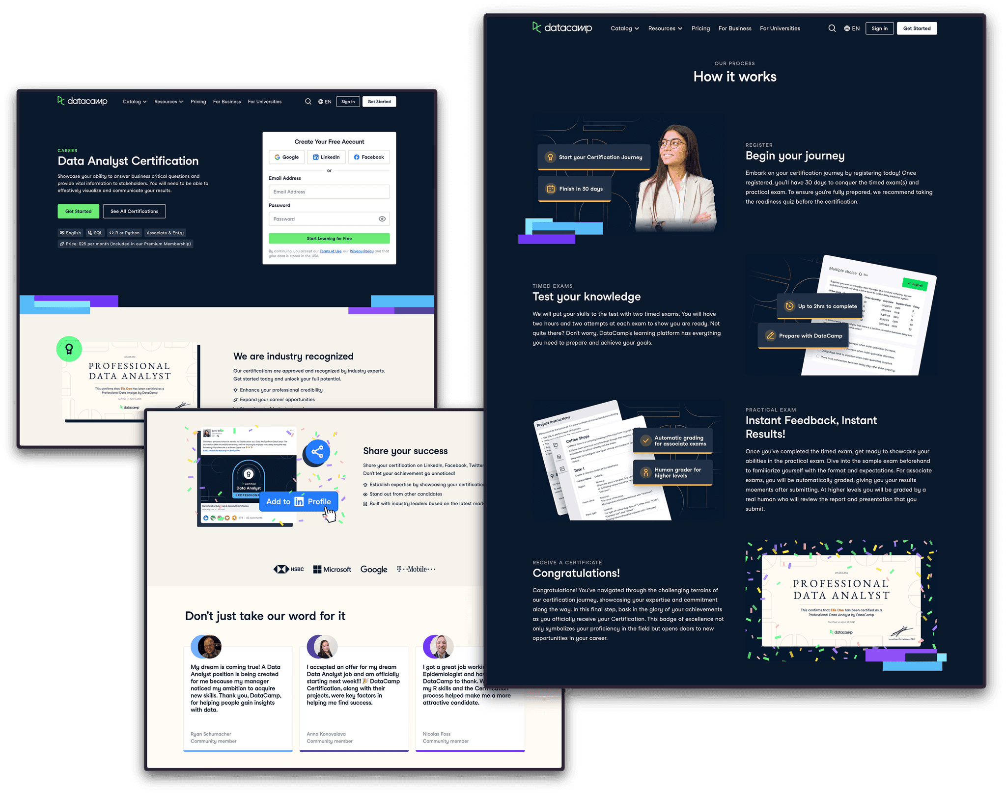
Something we were lacking - that every competitor of ours had - was a process breakdown section. It was clear to us that this needed to be introduced, as this is vital in helping a user decide if the process we are offering could work for them. I set about organising which sections we were lacking, breaking down our process into digestible sections, requesting copy, and creating the images myself.
Measuring success: What was the impact?
We started 2023 at
19.5k
logged out clicks
We ended the quarter at
73k
logged out clicks - just two months after the new pages released
Since releasing these new pages, our logged-out clicks have increased by 274.36%, which is a significant improvement and shows that there was definitely a demand for these pages. We will keep an eye on these metrics going forward as I would be curious to find out if this improvement is a result of us simply introducing pages which didn't exist before, or if it is because of a genuine improvement in structure that users are finding useful.
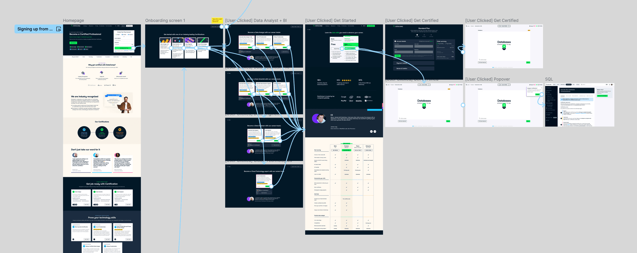
Step two: How do I sign up?
We created pages for each Certification, which was a great start. However, our onboarding process was the same, no matter which of DataCamp's products you were signing up to use. This meant that even if you were signing up from a Certification page because you were interested in getting certified, your onboarding process would instead direct you to learning materials for the general product.
This meant that our activation rates were low. We would see good conversion from our logged-off pages, but we were losing users as once they had made their account they would be directed into a different part of the product.
Reworking onboarding: Creating a proposal
I worked with the head of product to create an improved flow for our onboarding. The goal of the redesign was to route the user to the most relevant Certification, enrol them in the preparatory content and land them in the first preparatory course so they can start right away. The hypothesis was that landing users in a course will increase activation by showcasing better what DataCamp offers.
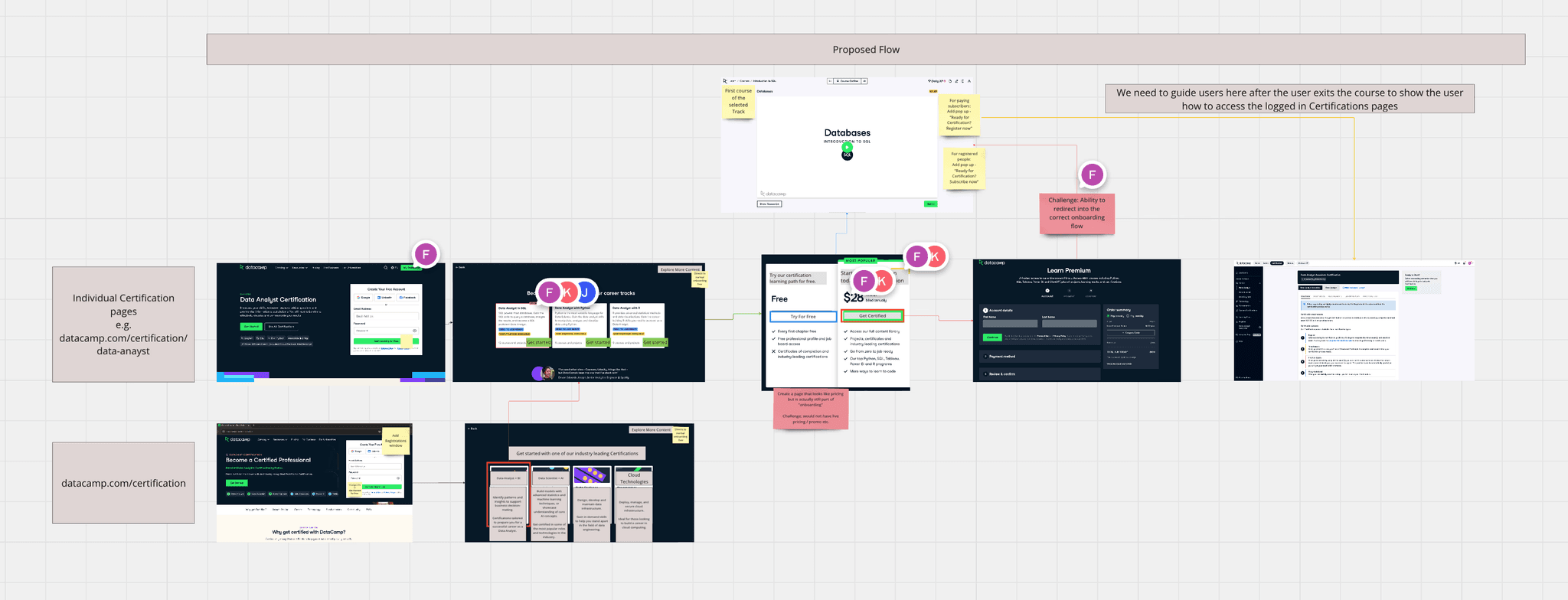
We also wanted to give users the option to pay for Certification straight away, so we added a button which takes them immediately to the checkout page (skipping the course enrolment). This was so we can capture more direct subscriptions for highly engaged users who are ready to take the Certification exam already.
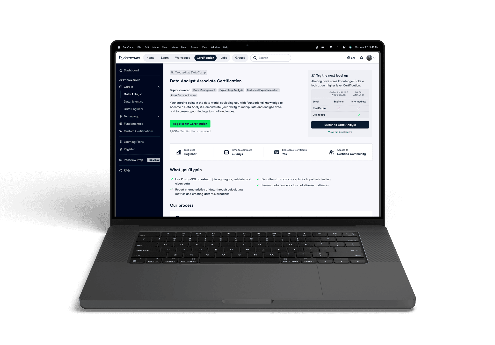
Step three: Reworking the logged-in experience
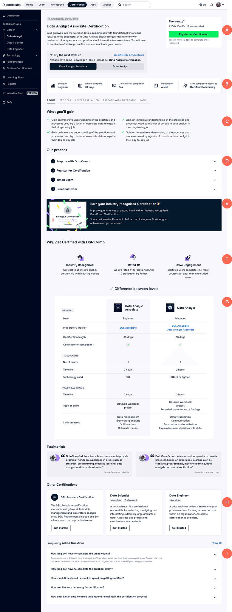
Our logged-in Certification description pages were underperforming, with a conversion rate of only 8.6%. These pages serve as a critical touchpoint between the user and our Certifications, where we articulate the value and purpose of our offerings and attempt to persuade users to enrol. Despite these pages receiving significant traffic, over 50% of our total registrations originate from them. This indicates that while these pages garner plenty of views, they fail to effectively convey our value proposition, resulting in lower-than-expected sign-up rates.
Evaluating the current page: Where can we improve?
TLDR - I hypothesised that these pages weren't performing well as we weren't explaining our value well, and these pages don't clearly outline what is required to earn a Certification. Valuable information about certain parts of the process are hidden behind tabs, and the pages are overall very text heavy, repeating themselves and putting off users from reading the content unless they are generally very motivated.
I highlighted the following areas for improvement:
What is this page? - We do not explain what this Certification is, or what it will help you achieve. We are missing the opportunity to show what value we can provide the user here
B
Levelling - Some of our Certifications have two difficulty levels to them. This is not clearly explained or demonstrated anywhere else on the page other than here
C
Registering - We are not giving the user many meaningful reasons to take this Certification. We state what exams they should pass but not what they could gain, how it could help their job search, or showing success stories
D
Tabs - Because this is so hidden (and also contains a lot of dense text paragraphs), the user will have to have high motivation to read it all. These tabs hide a lot of very relevant information, such as what a user will need to do to prepare for this Certification, and what it will test.
E
What is the process? - The section on our process acts as a brief overview instead of explaining each section in depth. The user will leave the page knowing how many exams to expect but not what will be tested, which is key information when deciding. This section feels overwhelming. There is a lot of tightly packed, uninviting text, as well as colour creating visual noise.
F
FAQs - A lot of important information about our process and requirements are hidden in the FAQs, which should be integrated into the section above as not many people will read it here
An example of how a Certification page looked before the re-design, with areas I'd like to focus on changing highlighted with red markers.
Sketching ideas: Designing in the open
I expected there to be a lot of back and forth, and iteration in this project so I made sure to start the design process with rough sketches instead of diving straight into more polish UI. This was to save time as I could iterate more and quicker this way.
I was lucky enough to have my stakeholders really love this direction on the first go. But it wouldn’t have been a problem if they have asked for changes since everything was so low-fi at this point and could be changed easily. The next step was for me to create a more polished version of the UI.
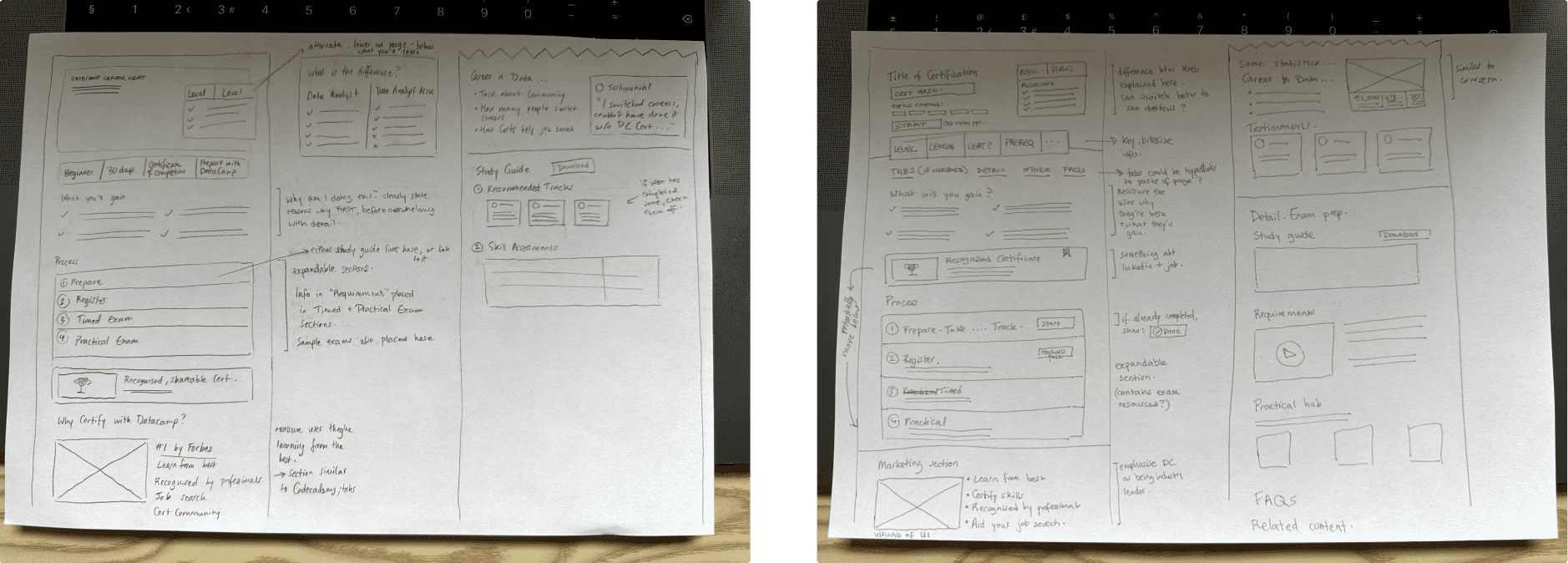
My sketches for how I wanted to structure the pages.
Refining: Creating the UI
Now that I had got agreement on the general structure of the pages, I now needed to refine the sketches and create something more robust.
The tricky bit was getting the information hierarchy correct, as you'd ideally want the user to realise that there are two levels to the Certification before giving up after thinking that the version they're currently viewing is too easy for them.
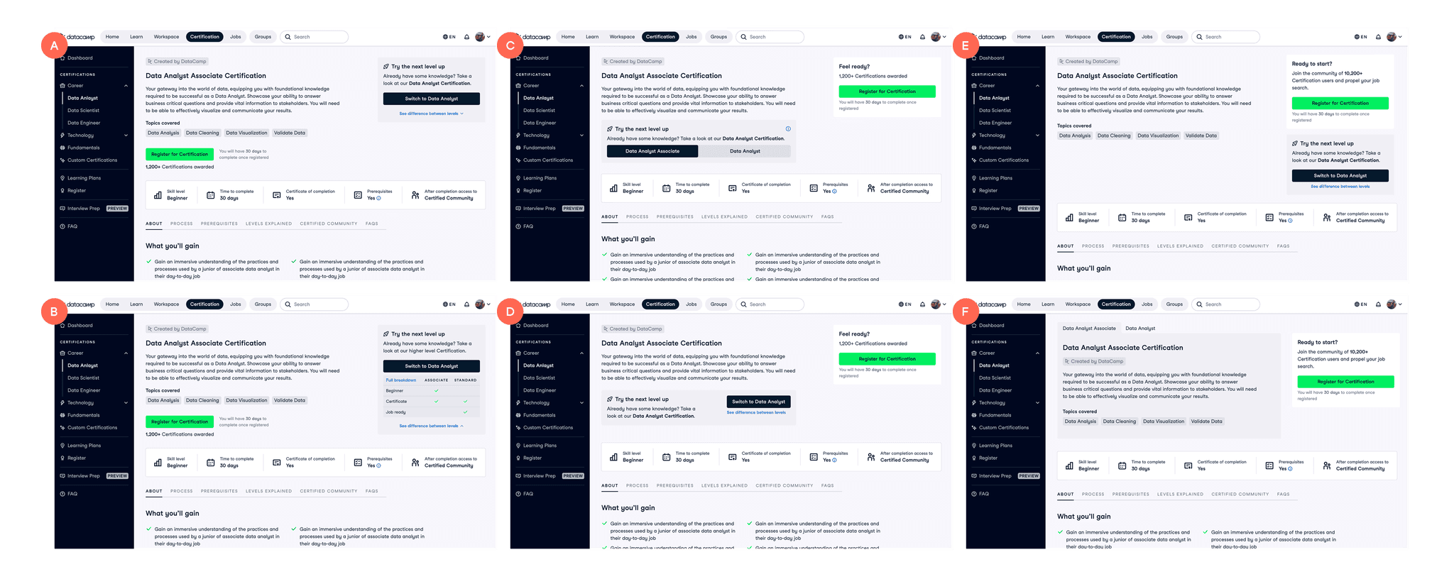
Different page layout options I created to show to the team.
I went through a few rounds of designs on this area, sharing it with the wider design team for their input, as well as looking through Mobbin to see if other websites had solved this problem. We eventually landed on a solution we were happy with. We agreed that the most intuitive place to put it would be just underneath the Certification description (option C), as only after you'd read this would you wonder about difficulty levels.
Another important aspect of designing these pages was considering the stage in the Certification process the user would be in when viewing the page. The content would need to change depending on whether they were viewing it for the first time, or had already registered for the Certification.
There were a couple of areas in the design I was finding challenging. The biggest area was deciding on the most intuitive way to switch between Certification levels (some of our Certifications had two levels of difficulty, and a restraint on the project was that these two levels had to live in the same page, with the ability to toggle between the two).
Final designs: If the user has not yet registered
How the page would appear to users who have not registered for a Certification yet.
Overview - Clarify what the user is seeing with a title, description on content, level clarification, and an easy way to sign up.
B
Key takeaways - Condense the key info on the page into bitesize pieces of information that are easy-to-process.
C
What you'll gain - By highlighting what they'll get from this certification, e.g. Industry recognised Certificate, standing out in the job market... User motivation is likely to increase, as they're reassured they're in the right place.
D
Process - Clearly show the process without being overwhelming. A lot of this information was previously hidden behind tabs that were mostly ignored.
E
Show the prize - Visualise the Certification the user will get at the end of the process, to highlight that they will get something tangible from their efforts.
F
Why DataCamp? - Reassure the user that they will be learning from the best & that this is a professional, recognised Certification.
G
Level comparison - Allow the user to see the differences between the two difficultly levels side by side. In the previous design the user would have had to navigate to a different page to find this information.
H
Continue to more content - Guide the user to more content at the end of the page, so they don't just reach a dead end like we currently have it. The user should also feel like these are tailored suggestions, not simply auto-generated.
I
FAQ - We reduced the size of this section as we integrated much of the important information here into the process.
Final designs: If the user has already registered
If the user has already registered, the focus would shift to focus on the stage of the process the user is in.
If the users next step would be to take the Timed Exam, the page would focus on this, emphasising the information necessary to prepare for and pass the exam. They would no longer be able to see all the more general, marketing-like information that was in the previous page.
Similarly, if their next step would be to take the Practical Exam, the page would have this step front and centre.
When the user passes their Certification, the page would display their achievement loud and proud, with clear links to download and share their certificate.
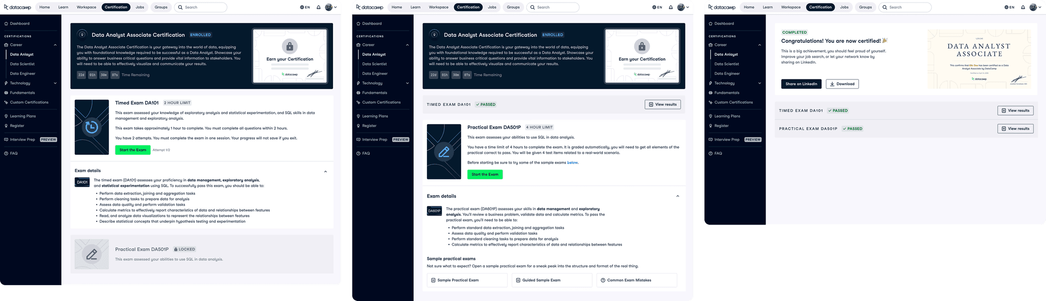
How the pages would appear if the user has already registered for a Certification.