Chargeback
Forecast and attribute Kafka costs
Managing Apache Kafka infrastructure is no small feat. For organisations that rely on streaming data, Kafka costs could easily be in the hundreds of thousands or even millions of dollars per year. We developed a system that allowed teams to become responsible for their resource usage.
The problem: Hidden costs, no accountability
Kafka infrastructure costs were spiralling out of control for enterprise customers, with some exceeding budgets by $600K+ without understanding why.
Technical barriers played a big role, as setting up cost tracking required deep technical knowledge through complex configuration files. This ultimately led to teams treating Kafka like it was unlimited, with no cost, and no accountability.
With proper Chargeback capabilities, we could help companies…
Understand the drivers for high cloud spending - Which teams are high spenders, and when did they spend?
Budget and forecast - Understand past trends to predict future costs
Efficiently utilise resources - Many companies found themselves paying for Partitions they don't use, landing them well into 5 figures with only a third actually needed
"
It took me six stressful weeks to untangle the ownership of just 50% of the topics in our clusters" - Customer feedback
Research phase: Understanding the users
I first needed to understand who would be using the product, so I could better understand their goals with Chargeback.
01
Management/Finance Teams
The people paying the Kafka bill who needed visibility into spending.
02
Platform Teams
The technical teams producing/consuming data who needed to understand their impact.
Through customer interviews and internal discussions, we learned that these teams could do cost tracking manually, which is quite labour intensive given they have to create custom solutions. This also does not clarify ownership, which makes it harder to identify where to cut costs.
Based on these personas we decided the following.
It was important that all the values shown were accurate down to the penny. This would help the Management teams avoid estimation. There should be proportional cost allocation based on actual usage, and the insights shown should also be real-time. This would help the Platform teams understand their impact and allow them to catch misconfigurations and overspending quickly.
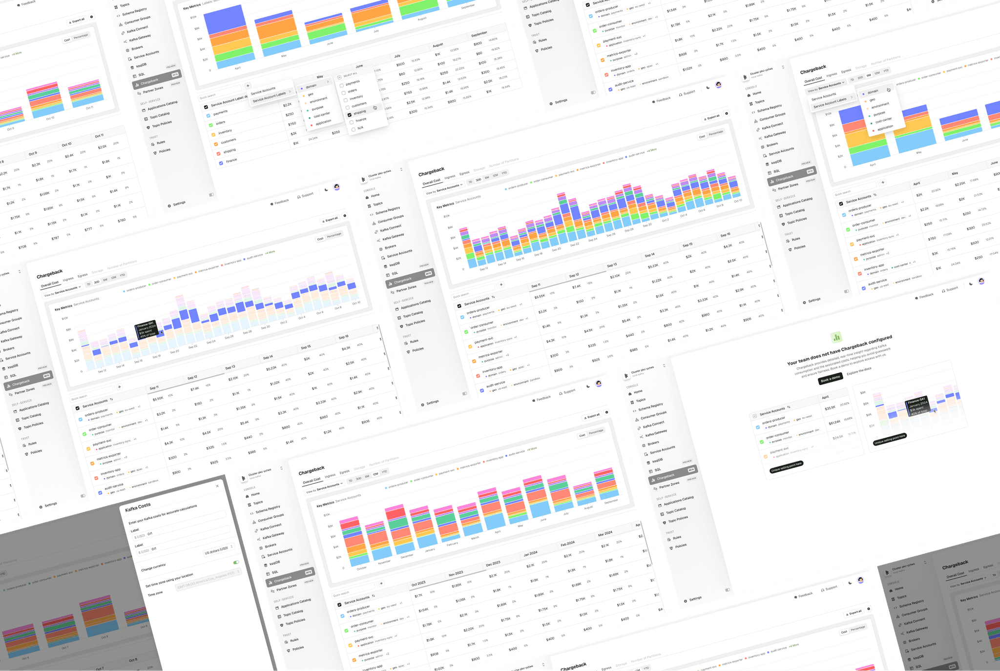
Initial design exploration for Chargeback.
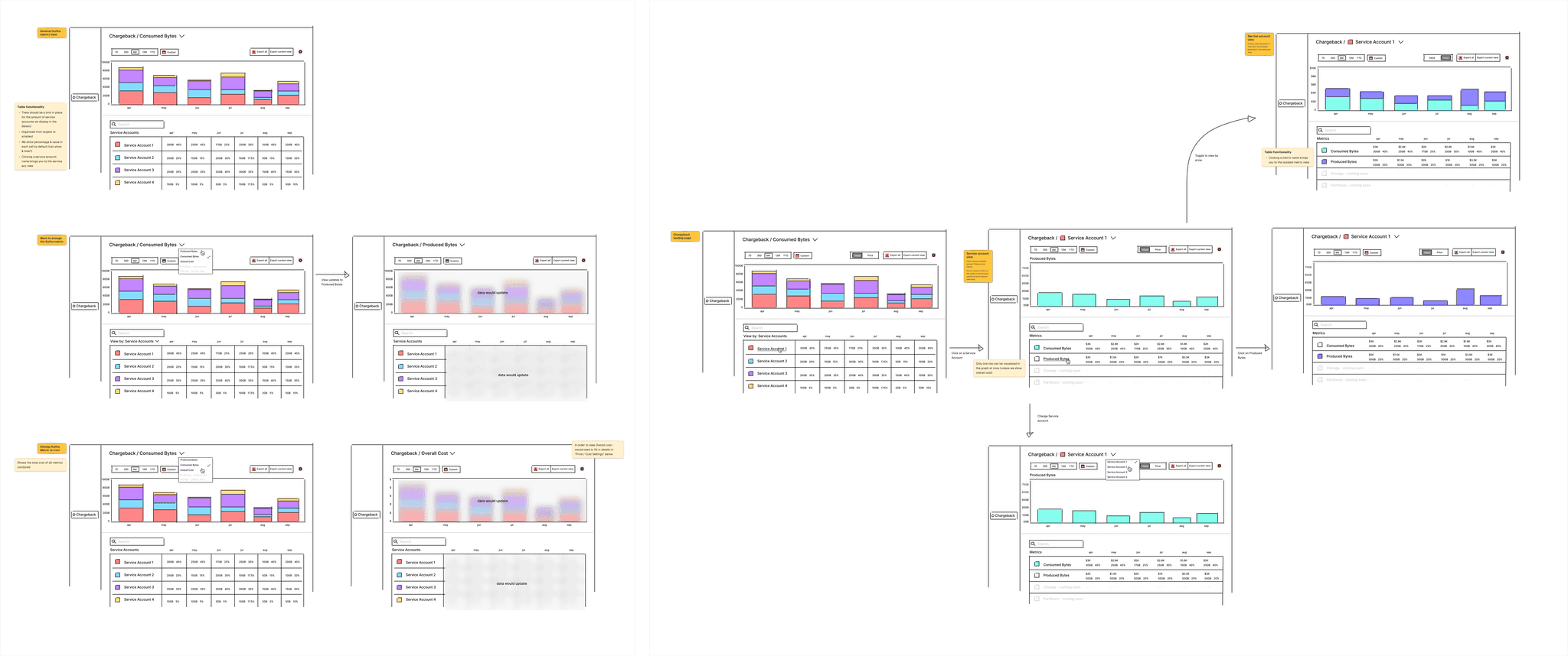
Wireframing: Finding clarity
There was a lot of discussion with the team in these early stages to try to make this as simple as possible on the first go. This was quite a big project and I wanted to avoid creating something super complex, however needing re-working later. A lot of time was spend on in the wireframing stage trying to figure out what this compromise would be.
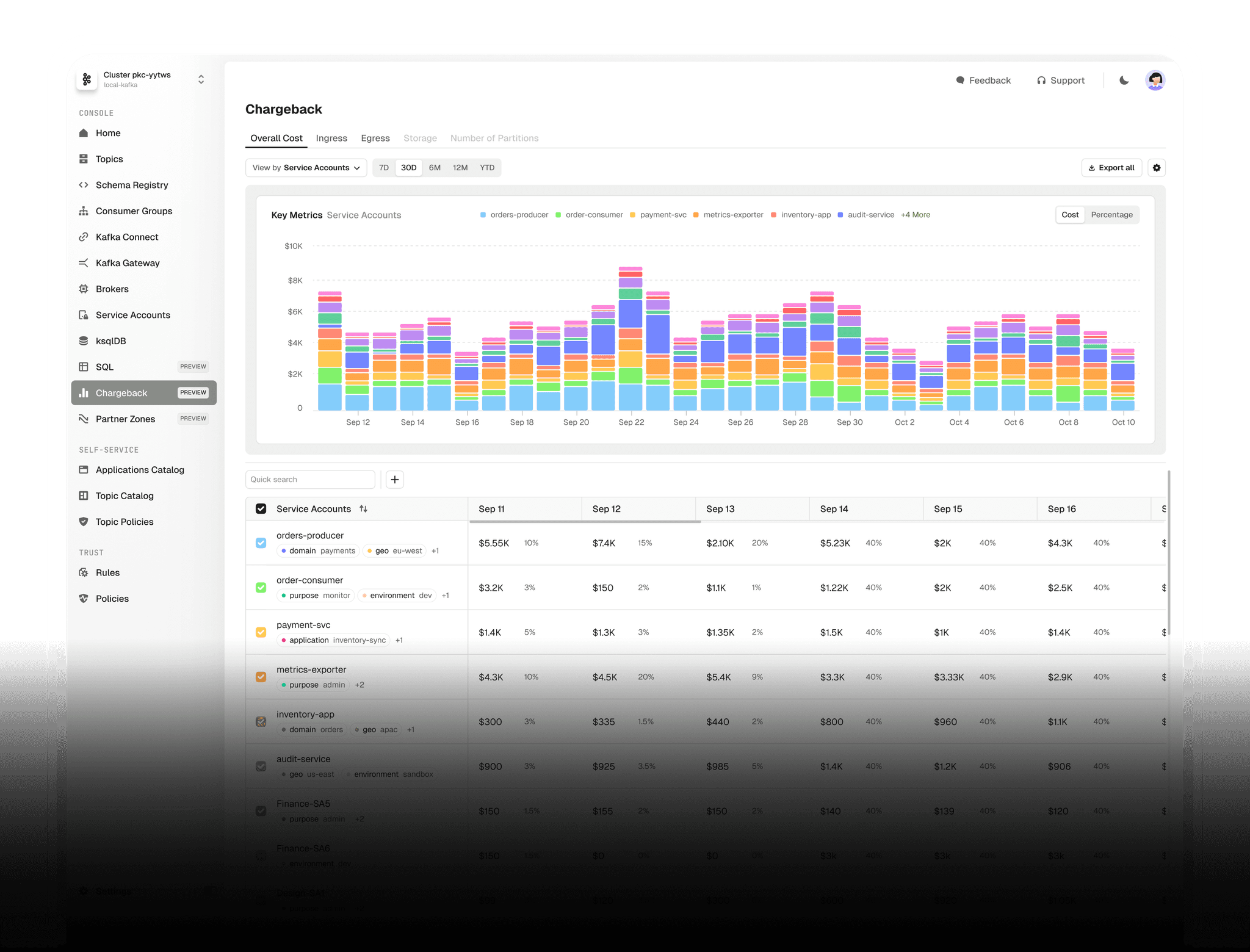
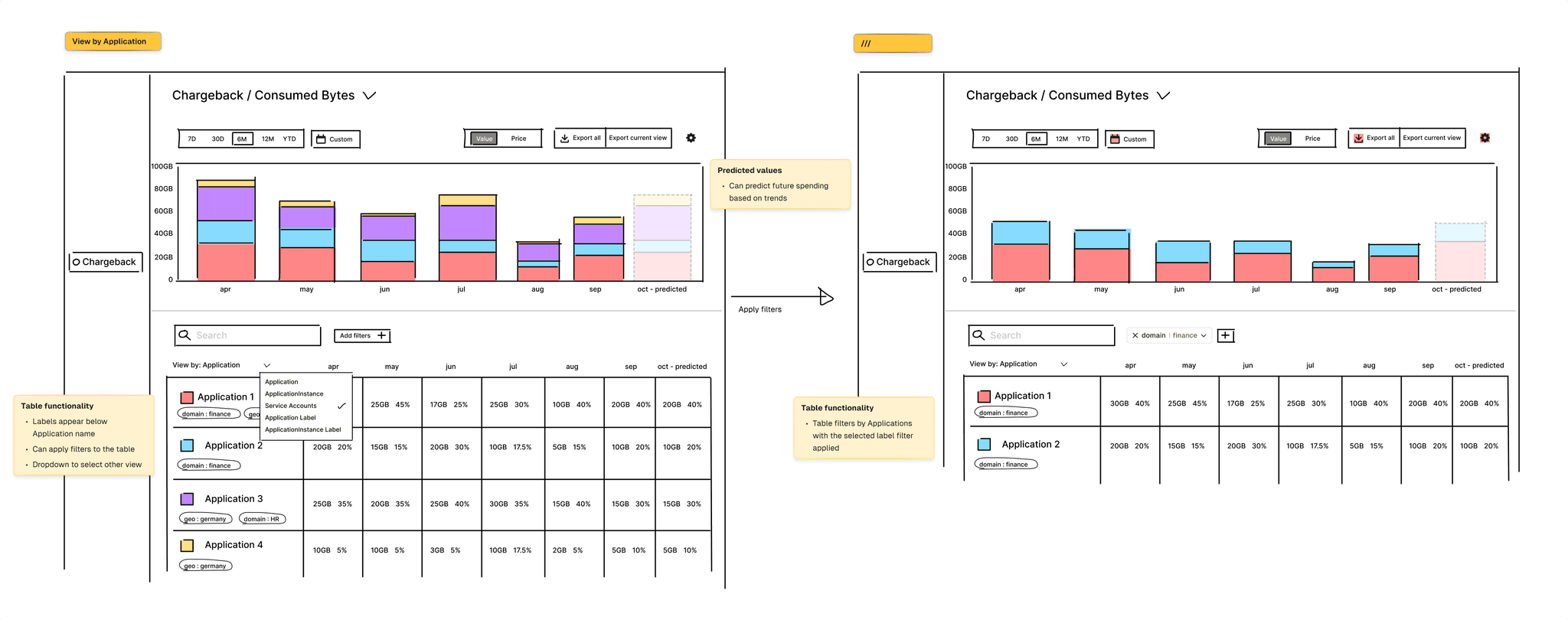
After a lot of exploration, we decided on a split-screen approach. This allows the user to both see what is happening at a glance, and give them the ability to dive deeper if desired. The top half of the screen should show a stacked bar graph, allowing them to view costs by when it happened, and which team is responsible. This also enabled non-technical users to track costs as its main goal was visual clarity.
Users could then use the table in the lower half to investigate deeper - with the ability to drill-down and filter or sort the data.
Playing with functionality once we had agreed on a layout.
We made sure to map out the user journeys as we made our way through this stage, to ensure we were effectively tackling user problems and leading them towards value.
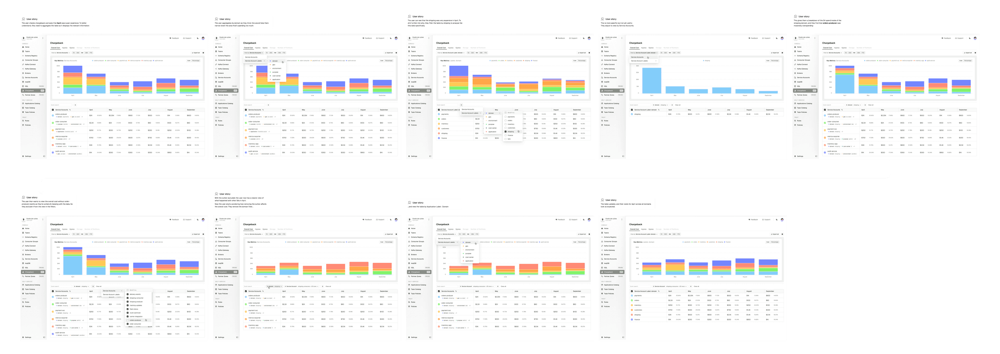
We used user stories to help us understand the flows, and how users might want to explore Chargeback.
Design System: Data visualisation
As part of the Chargeback project, I needed to add more data visualisation colours to our design system. While we had semantic colours for success/error states, we needed a collection of non-semantic colours for data visualisation where colours have no meaning, and can be picked at random.
I developed a colour system with light and dark versions of each, plus a library of bar chart examples demonstrating usage. This is now a core part of our design system documentation, serving as a frame of reference for future bar graphs.
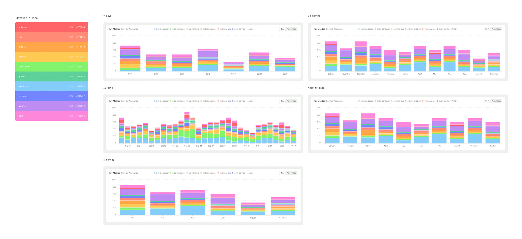
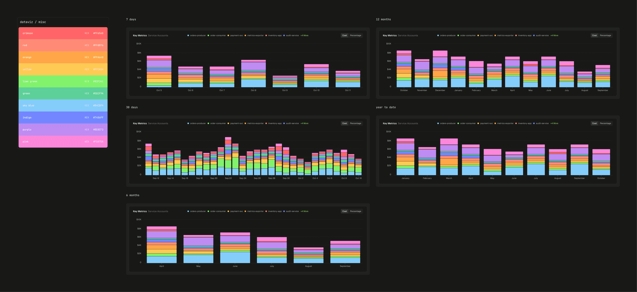
The data visualisation colour collection on the left, and examples of different bar chart time period displays on the right.